“London is satisfied, Paris is resigned, but New York is always hopeful. Always it believes that something good is about to come off, and it must hurry to meet it.”
Dorothy Parker
Just hearing the words New York conjures up more images than the mind can hold – from Wall Street to Park Avenue, Broadway to Central Park – the people, the pace, the passion – it’s all overwhelming. How could anyone attempt to capture the magic of the Big Apple in a simple handkerchief? Yet a select few have managed to portray the crackle and pop, the magnetism that is “the City”. Artists Carl Tait and Tammis Keefe are two who knew how to imbue their images with the sparkle, the moxie, the glitz, the romance, the pizzazz that is New York. (Their bios are at the end of this blog.)
These whimsical, flirtatious accessories in brilliant hues, followed on the heels of an era of war and rationing, of practicality and prudence. Finally, it was time to celebrate, indulge a little, splurge on fashion, and have fun. It was a time to possibly travel for the first time and bring home a souvenir or two.
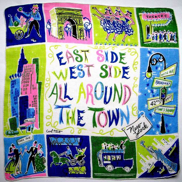
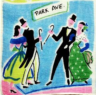
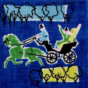
Carl Tait’s colorful rendition is exuberant and effervescent, from the swells sashaying up Park Avenue to a galloping giddy-up through Central Park.
 |
 |
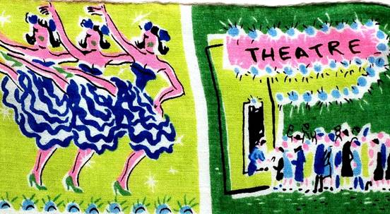
From the Rockettes kicking up their heels at Radio City to glittering marquees on The Great White Way (of Broadway)
“There is no place like it, no place with an atom of its glory, pride, and exultancy. It lays its hand upon a man; he grows drunk with ecstasy;he grows young and full of glory, he feels that he can never die.”
Walt Whitman
“East Side, West Side” are lyrics from the 1894 song “The Sidewalks of New York”, composed by Charles B. Lawlor, lyrics by James W. Blake. Over the years, it’s been played by everyone from Mel Tormé to The Grateful Dead. Although Tait’s images depict uptown and the high life, the song actually refers to the simple pleasure of playing with your neighborhood friends, and dancing to the music of the hurdy gurdy man.
| The Sidewalks of New York
Down in front of Casey’s old brown wooden stoop On a summer’s evening we formed a merry group Boys and girls together we would sing and waltz while Jay played the organ on the sidewalks of New York East Side, West Side, all around the town That’s where Johnny Casey, little Jimmy Crowe Things have changed since those times, some are up in “G” others they are wand’rers but all feel just like me they’d part with all they’ve got, could they once more walk with their best girl and have a twirl on the sidewalks of New York. |
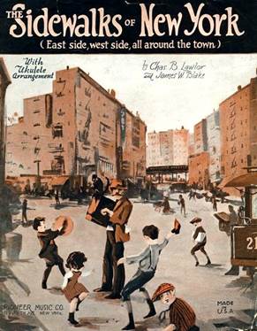
(1914 sheet music image from Wikipedia) |
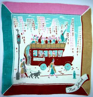
Duplicate renditions of a Fifth Avenue Scene, one in cool spring colors, one in ebullient hues of summer. Tait is such a master of color, I wanted you to experience both.
 |
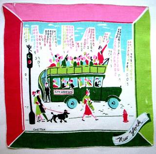 |
Tait conveys maximum impact with minimal images, yet the exhilaration and excitement of visiting The Big City shine through in every brush stroke. Tourists gape in awe and wonder.
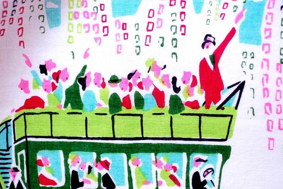
While the locals take it all in stride.
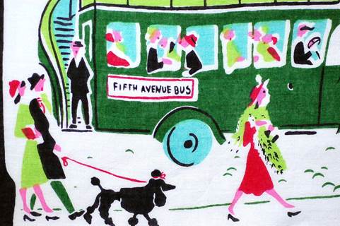
“New York ladies all look immaculate.”
Zac Posen
Central Park hosts sailors on leave, horseback riding, new parents, rowing on the lake, a fantastic zoo, and more. It’s a slice of the city – colorful and charming.
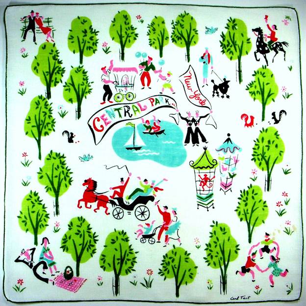
“In New York the sky is bluer, and the grass is greener, and the girls are prettier, and the steaks are thicker, and the buildings are higher, and the streets are wider, and the air is finer, than the sky, or the grass, or the girls, or the steaks, or the air of any place else in the world.”
Edna Ferber
While in the park…you can almost hear the clip clop of horse’s hooves as this carriage makes its way along. From the depiction of illuminated windows, we get the feeling this is a romantic ride at eventide, and the gentleman at the base of the monument may be trilling an aria to the passing crowd. Like Tait, artist Tammis Keefe leaves is a master of maximum impact with minimal graphics. Perfection!
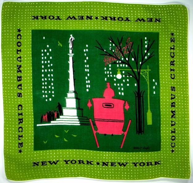
Keefe is probably the most prolific and certainly the most well-known of the mid-century modern textile artists. Unfortunately she passed away in 1960, at the height of her creativity. I particularly like her New York series, possibly created for one of the major department stores. Employing the same color palette, we get an entirely different feeling when we move down to 42nd Street. It’s non-stop sizzle and pop, glowing marquees and ACTION. The miniscule theatregoers underscore the enormity of the Times Square Alliance that includes Broadway theatres.
For a respite, we hop the Staten Island Ferry, letting cool breezes kiss our cheeks while we enjoy the inspiring skyline from afar.
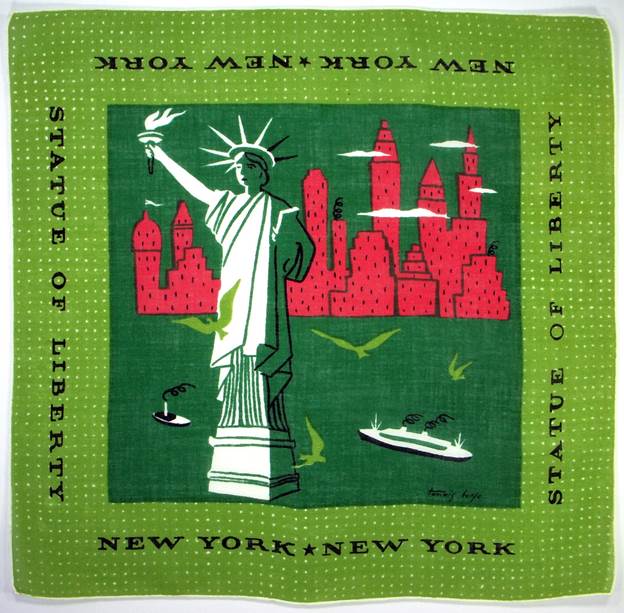
I wanted to show you how very different Keefe’s images can feel, even when executed with the same color palette. Before we leave Central Park behind us, let’s hop back up the zoo. Electric blue and bitter chartreuse convey the vibrancy of the venue, while a cool grey border keeps everything in check.
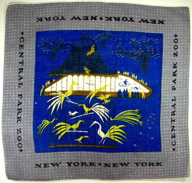
| Every detail is addressed, down to the pecking pigeons and the jaunty angle of the woman’s hat as she watches the seal perform. Nothing is overlooked, yet the effect is minimalistic. I don’t know how she does it. Keefe’s eye is razor sharp; her renditions are flawless, yet feel relaxed and welcoming. | 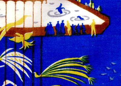 |
Washington Park in winter -only the crows remain to forage, while stray newspaper flutters about.
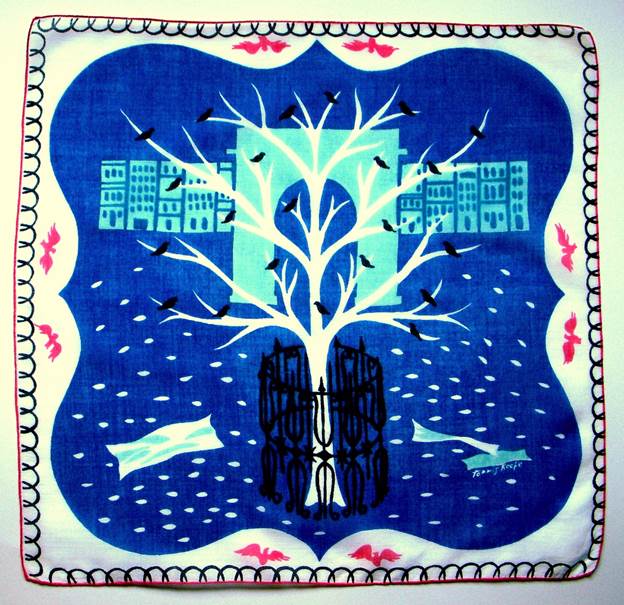
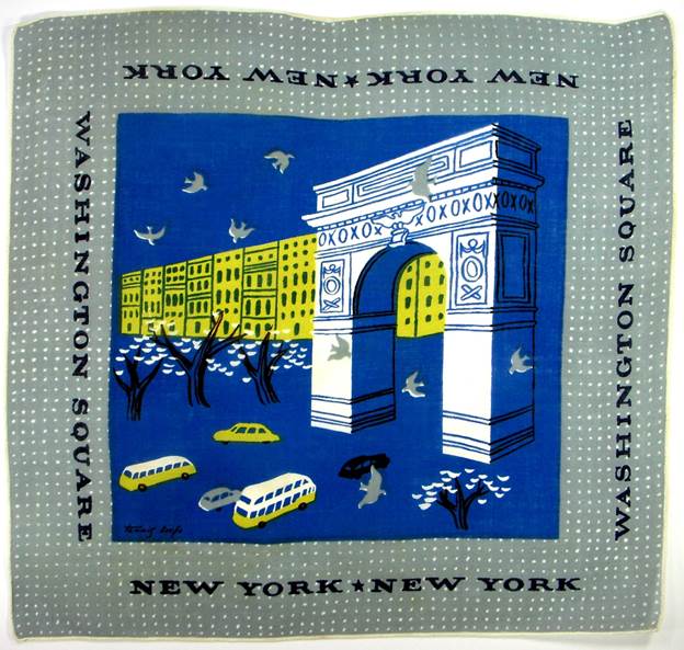
The scene above depicts a cold, shuttered season, while the scene below sings of lemony bright spring. Horns are tooting, trees are blossoming, birds are soaring. Same park, different feeling. Again, perfection. The original arch was erected in 1889 to celebrate the centennial of George Washington’s inauguration as president.
“One can’t paint New York as it is, but rather as it is felt.”
Georgia O’Keefe
When you live in the city, any park provides a welcome respite, regardless of size, and the Plaza Park on Fifth Avenue is a perennial favorite. Note the beloved horses and carriages nearby.
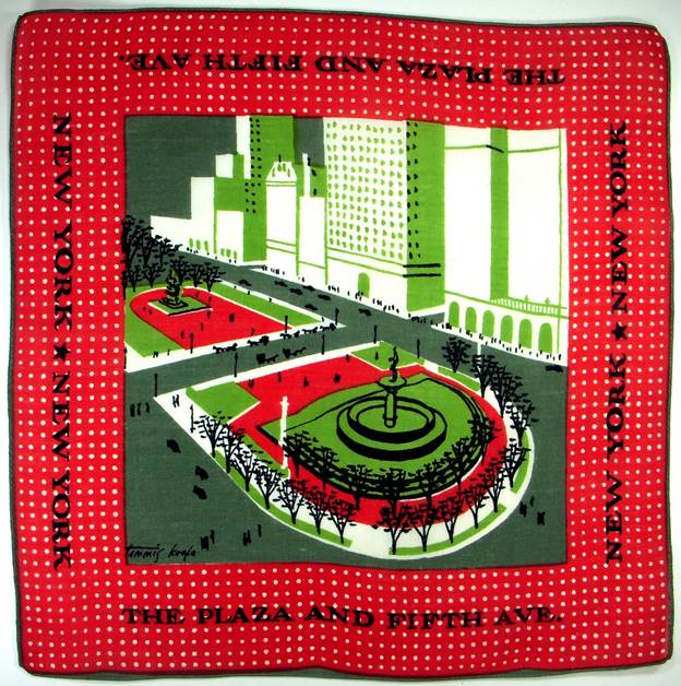
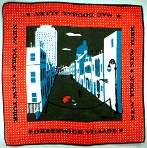
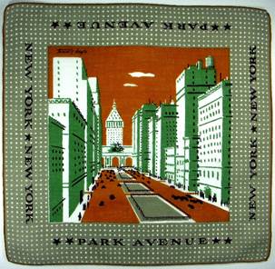
Keefe’s depictions of the Grand Canyon-like alleys and avenues sandwiched between towering skyscrapers is spot on, be it the smaller byways of Greenwich Village or towering and toney Park Avenue with its landscaped center islands.
 |
 |
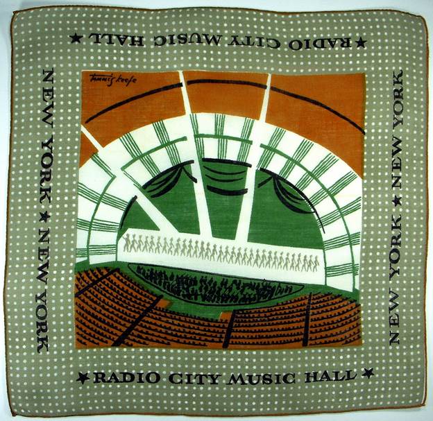
The unexpected but oh so handsome gray-green/chocolate color palette is once again successfully employed in her rendition of Radio City with the fabulous sky-kicking Rockettes. As with previous handkerchiefs, upon close inspection, you’ll find tremendous detail in the rendition of the orchestra.
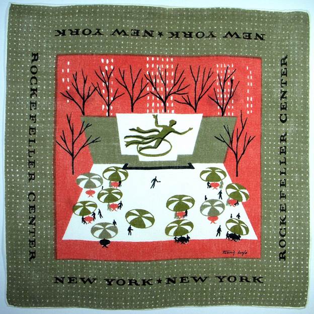
Early fall on the Plaza in Rockefeller Center, with a palette of soft grays, olive and salmon. Yum. You can’t help but smile and wish you were there.
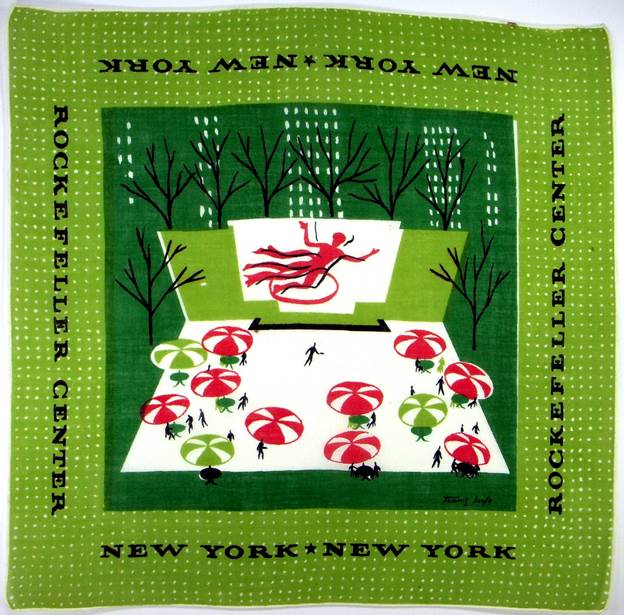
Admittedly, it’s spectacular in spring as well.
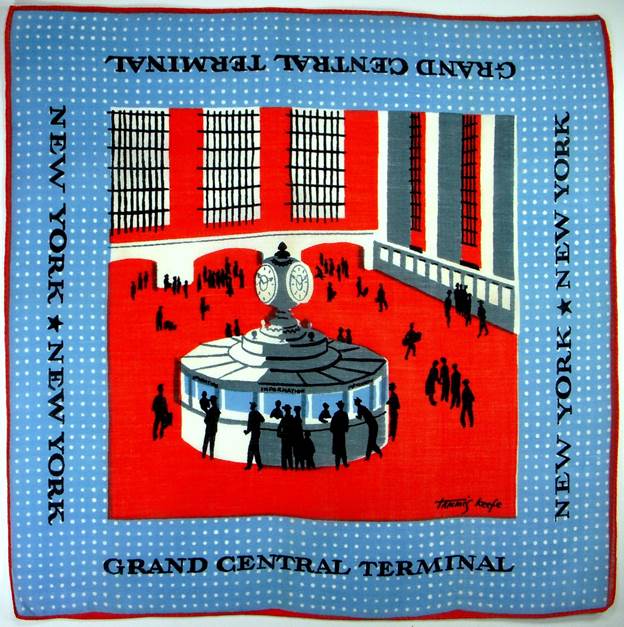
If you’ve ever seen a time lapse video of Grand Central Station, you’re aware that even in off-peak hours, it’s a beehive of energy. Covering 48 acres, an estimated 750,000 people pass through the station daily. Fire engine red seems an appropriate color choice, with sky blue to cool down the heat.
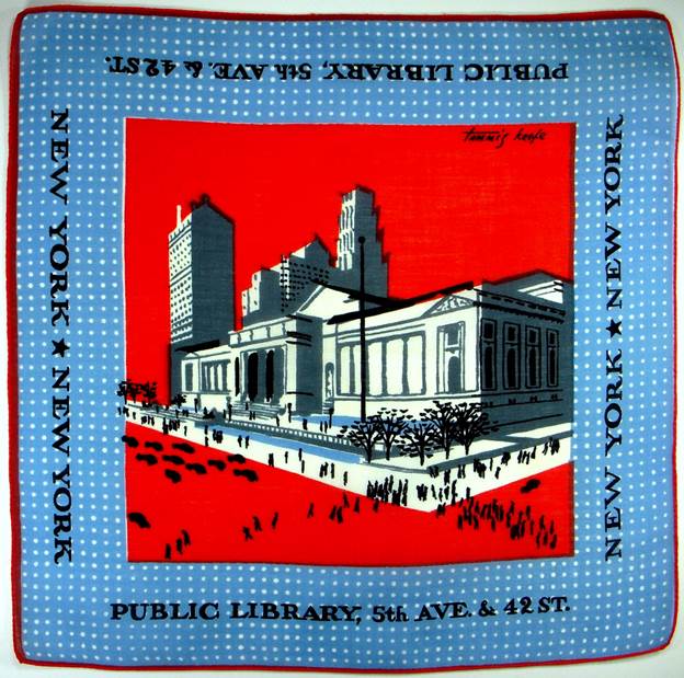
Another dynamic landmark and beloved institution is the New York Public Library, so it seems only fitting to depict it in powerhouse red as well. Second only to the Library of Congress in size, it houses nearly 53 million items. Open since 1911, the library receives over 2 million visitors annually.
Keefe also did a masterful job of depicting entire sections of Manhattan, including mid-town through Central Park. Classy, sophisticated, clean-lined, delicious.
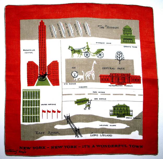
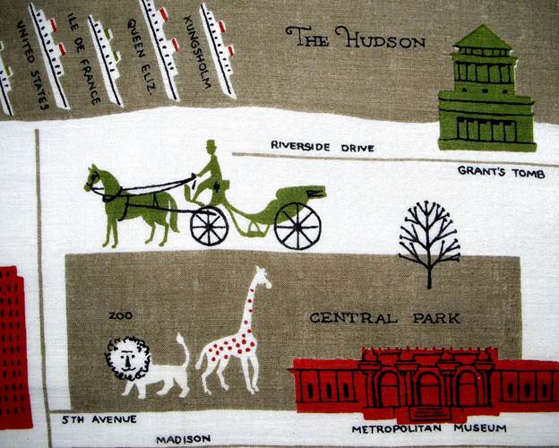
As well as the south end of the island and downtown. New York can seem so overwhelming, but note how Keefe manages to simplify it all, without eliminating any of the action.
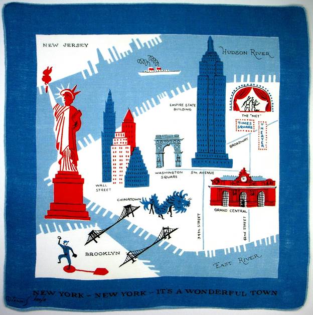
Even the people under the Chinese New Year dragon are depicted, and we can almost hear the arias at the Met.
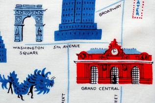 |
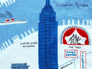 |
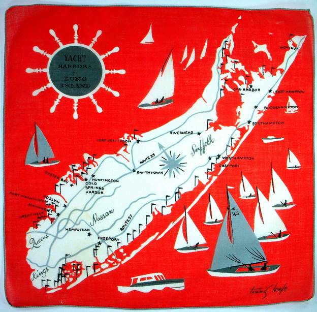
A fun rendition of Long Island devoted entirely to yacht harbors. Makes you want to hoist a sail right now!
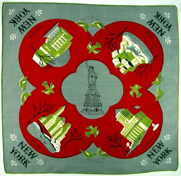
Although unsigned, this historical monument handkerchief has been attributed to Keefe, and indeed it employs the same unique type font that she utilized in her Valentine handkerchiefs.
Handkerchiefs have always been part and parcel of the New York fashion lexicon. The early cognoscenti – Stuyvesants, Astors, Morgans, Roosevelts and Vanderbilts – carried handkerchiefs that were silk, monogrammed and perfumed. Soon the roaring 20’s arrived, and hankies were come-hither and coquettish, fashioned from both decorative silk and practical cotton. Everyone was puttin’ on the Ritz at Delmonicos, the Stork Club, El Morocco and the Cotton Club. Duke Ellington, Cab Calloway and Fletcher Henderson showed the swells how to swing. A hankie was essential after all that heating dancing! During the war years, hankies became a way to brighten your wardrobe for pennies, and they were draped over belts or tied to bracelets as eye-catching accessories. With the advent of color-fast dyes and new milling techniques, artists finally had the perfect palette to unleash their inner Picasso. These fun, flamboyant handkerchiefs have lasted for 70+ years because of their quality (and because they were cherished).
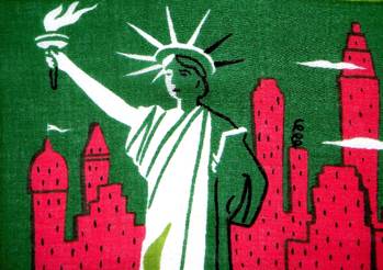
“The glamour of it all! New York! America!”
Charlie Chaplin
BONUS
Since we’re featuring New York collections, this is the place to mention another category of popular collectibles – the embroidered handkerchief. Scallop-edged souvenir hankies were extremely popular and can still be easily found today.
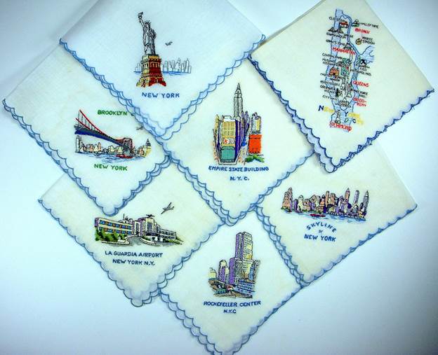
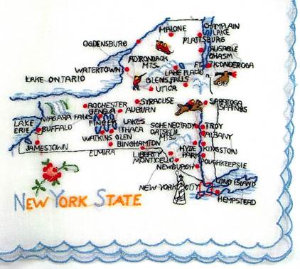
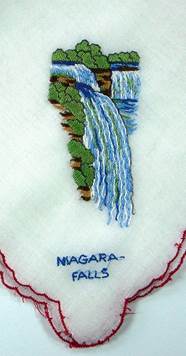
As we did in New York, New York we’ll start with a bird’s eye soar over the state then zoom in on Manhattan. Note the teensy Statue of Liberty in the hankie on the left, while a popular honeymoon destination cascades on the right. Lovely.
 |
 |
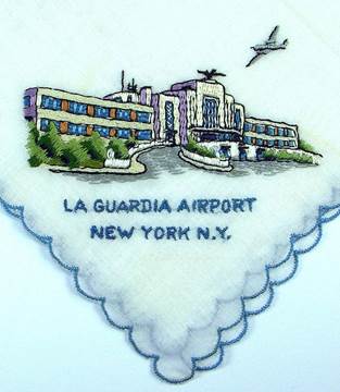
Time to fly in, and hopefully catch a glimpse of the skyline. Who knew La Guardia had its own souvenir handkerchief?
 |
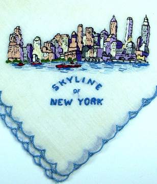 |
Naturally on the ride into town, you hope to catch a glimpse of the Statue of Liberty.
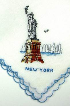 |
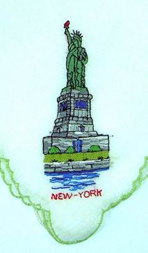 |
Cross the bridge, and you’re finally in The Big Apple. Note the detail – the Empire State Building, another little Lady Liberty and even a little plane departing LaGuardia.
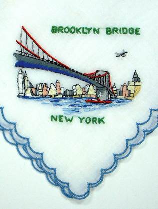 |
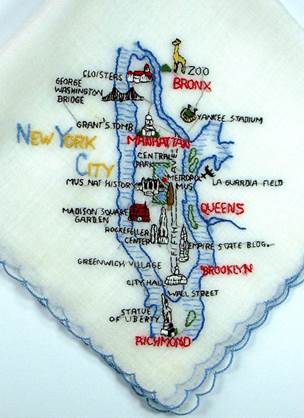 |
Rockefeller Center, the Empire State Building, the United Nations – it seems there was a souvenir handkerchief for every landmark. Note the tiny cars, trees, and billboards. Because of their delicate embroidery, these pieces were saved for fashion statements, and were often draped over a belt.
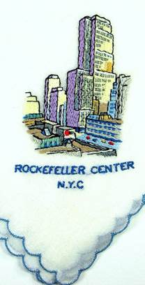 |
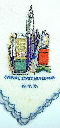 |
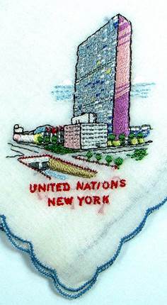 |
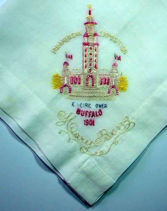
Embroidered souvenir handkerchiefs have a long history. Below is another New York gem, from the Pan-American Exposition held in Buffalo in 1901. Note the image of the Electric Tower is hand embroidered, while the name Mary Benz is machine embroidered. Handkerchiefs were purchased at the fair, and your name was added “by machine!” (a big deal), while you waited! We also witnessed this “modernity” at the Columbian Exposition or Chicago World’s Fair of 1893.
About the Artists
Tammis Keefe
Margaret Thomas Keefe was born December 27, 1913. Barely a week before her birth, her father Thomas passed away. Her family called her Peg, a nickname for Margaret, and she signed some handkerchiefs Peg Thomas. Apparently Tammis is Gaelic for Thomas, so when writing her name, whether she signed as Tammis Keefe or Peg Thomas, she paid silent tribute to a father she never met, which I find both poignant and endearing.
Growing up in California, Keefe attended Chouinard, now part of California Institute of the Arts. She later served as art director of Arts and Architecture, a publication considered hip and innovative when it came to layout and design. In the early 1940’s she joined the studio of Dorothy Wright Liebes as a colorist and print designer, working first in San Francisco, and later in 1948 in Liebes’ New York studio. While there, Keefe provided textile designs to Goodall Industries. In addition, she designed decorative home furnishing fabrics for Golding Decorative Fabrics, Cyrus Clarke and Jud Williams Inc. In addition to textiles, Keefe designed kitchen linens, tablecloths, placemats, napkins and cocktail napkins for Fallani & Cohn, Falfax All Linen and Goodall, as well as wallpaper for James Mills and Katzenbach & Warren. One of her designs created for Golding, “Lemons” was shown at the MOMA Good Design Exhibition of 1950, which traveled to Europe.
One story which became legend, for which I could not find the source, but which certainly sounds plausible, is that Keefe gifted a friend with a handkerchief which read “Happy Birthday” in bold letters with accompanying candelabra, employing a palette of purple, turquoise, sapphire and chartreuse. Her friend show it to Lord & Taylor’s handkerchief buyer, who in turn showed it to J. H. Kimball, who commissioned a series of designs. Keefe’s first hankies were created to appeal to different personalities including the antique collector and the musician. Lord & Taylor continued to place orders for years. In 1949, the San Francisco Chronicle interviewed Keefe while she was in town to promote her Christmas handkerchiefs selling at Joseph Magnin. “Handkerchiefs are fun to do, and I try to make them fun to give” said Keefe. Did she ever. She was the first to do Christmas in hot pink and turquoise rather than the traditional red and green. Keefe did a series of designs for a “See the USA” campaign, and I believe these New York handkerchiefs are part of that campaign (which included San Francisco, Philadelphia, Chicago, and more.)
Keefe herself said it best: “Color is the most important factor in design generally, and in handkerchief design specifically, color prepares the emotions for the design itself, as music sets the mood of the Play.” (from Craft Horizons, 1952) Her brilliant eye for design, her imaginative use of color, her ability to say volumes with minimal fuss and her sheer sense of fun and joy changed the world of handkerchiefs forever, creating wonderful little works of art to carry with us always.
(There is much more to say on Keefe and I plan to do so in a future blog.)
Carl Tait
I searched high and low for information on this energetic, ebullient designer. Sadly, the first information I was able to find came from his obituary: “Mr. Carl Charles Tait, age 93, of LaGrange, GA, died on Wednesday, May 11, 2011, at Doctor’s Hospice in Fayetteville, GA. He was born November 2, 1917, in Old Town, ME, to the late Harry Tremain Tait & Mary Belle Madore Tait….After high school, he served in the United States Army Air Corps from 1942 to 1946. He graduated from New Hampshire School of Arts & Sciences.
He was a creative and wonderful artist, with claims to fame such as a large mural that is still proudly displayed in the Greenville/Spartanburg, SC, airport, and Christmas cards distributed by American Artist’s Group. He even designed a line of handkerchiefs that was available exclusively through B. Altman & Company department stores. He also used his artistic talent and innovative spirit while working as an independent contractor for Milliken Corporation, where he traveled around the United States designing showrooms for product displays. You have seen examples of his work on this blog in both Christmas and Valentine listingsand others. Tait combined a gimlet eye with a sensitive heart and artists touch to charm us all with his inspiring graphics.


Annie you are such a wonderful writer. I really enjoy reading your vignettes.
Linda
Wow, and everything I could find on Carl Tait was in this article. I wish there were a book of his handkerchief line alone.
Oh so do I. Readers? Does anyone have anything to add on Carl Tait?
Carl Tait was my first employer; he became my mentor and ultimatley as time went on, my dear friend. I was married in his home and named my son, Tait, after him. he was the most inspirational person I have ever known. Loved him dearly.
How on earth did I miss your comment until now? Mea culpa. Carl Tait was an amazing, creative, colorful, inspirational artist. Each and every one of his designs makes me smile. From his magnificent color choices to his ability to capture humor, romance, a sashay of the hip and a skip in the step, he must have been a joyful, lighthearted spirit, with a gimlet eye for detail. What a lucky woman you were to have known him personally and studied under him. I’m sure you have stories galore and I would love to hear any or all of them. Please contact me if you would ever like to chat via phone as I would love to hear your memories and stories. I’m goose bumps just writing this.