

“Postage stamps have been in my blood since early childhood.
My older brother and I fought to the death for
the possession of our stamp collections.”
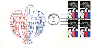
Alan A. Blackman
From our opening quote, you might assume we’ll focus on stamps, and indeed, we’ll view some remarkable ones. But in this instance, it’s the dance between the stamps and handwritten addresses that will hold you spellbound, as the stamps provided a springboard for the imagination, wit, charm and talent of calligrapher Alan A. Blackman.
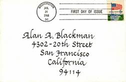
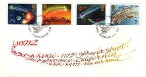
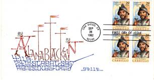
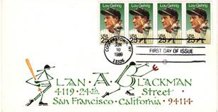
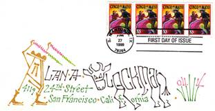
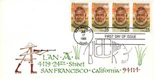
I’ll keep the facts brief, so you can delve right into his visual magic. Recalling the excitement he felt as a boy receiving something personally addressed in the mail, Blackman decided stamp collecting might also delight his young son Stephen. In 1968, Alan began surprising Stephen with hand addressed envelopes which contained First Day Cover Stamps. Each bore “First Day of Issue”, along with the date and city of the first sale. Simultaneously, Blackman would address a similar envelope to himself.
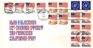
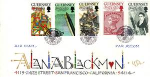
Over time, the addresses became more and more fanciful, and Alan searched far and wide for First Day Issues from around the globe. Soon, a gift for his son grew to become an “Accidental Collection.” Blackman had no idea when he began that his endeavor would span forty years and hundreds of stamps. It wasn’t until 2004 that he discontinued the tradition. By then, his son was grown and traveling the world as a TV cameraman, thus new envelopes became difficult to deliver. Interestingly, over the years, Alan became as peripatetic as both his son and the stamps, teaching calligraphy around the US, England, Germany and Japan.
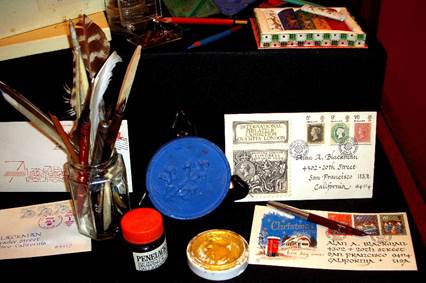
Alan first learned brush calligraphy, later mastering steel nib pens and feather quills! He also ground his own inks.
“What joy there is in hearing yourself think,
and to make that thinking into ink.”John Olsen, Australian Artist
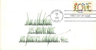
What began with italic calligraphy, soon took on a life of its own, in this instance, to become as lively as a lush lawn in summer.
 |
 |
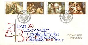
| Susan Cain’s marvelous book Quiet, which extolls the virtues of introversion, might be a perfect companion piece to this Robert Kennedy stamped envelope. The script is a dichotomy of soft yet strong, self-contained yet quietly visible. The gently rounded corners and tight spacing bring to mind a youthful personality that is at once both energetic and shy. |  |
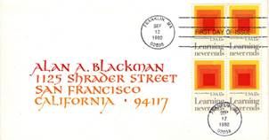
Eventually, the inks began to echo the colors in the stamps.
 |
 |
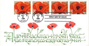
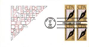
Before long, the images on the stamps began to infiltrate the calligraphy.
 |
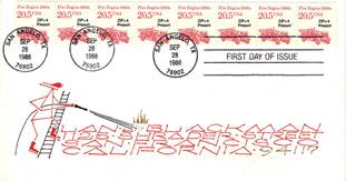 |
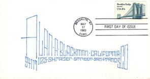
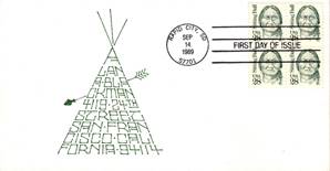
Until one day, the letters themselves emulated the energy of the stamp – from the Brooklyn Bridge to Chief Sitting Bull.
 |
 |
I wonder if the post office had as much fun deciphering the addresses as Blackman had creating them?
 |
 |
It’s particularly fun when the calligraphy literally comes to life with anthropomorphic letters.
 |
 |
From matadors to big game hunting, I’m sure Hemmingway would have enjoyed receiving a letter addressed thusly. Note both bull and elephant form Blackman’s last name.
 |
 |
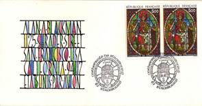
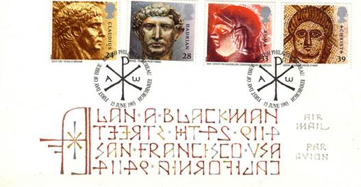
His artist’s eye beckons you to follow in his footsteps, to pause and appreciate the splendid stamp images – from brave crusaders wielding their swords, to breathtaking stained glass windows in the Cathedrale de Strassbourg.
 |
 |
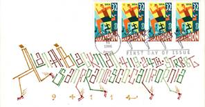
Whether running a marathon or penning a novel, we’re swept up in the energy of the event, and we long to join in the experience.
 |
 |
Being a lover of handwriting and its history, I was delighted to discover Blackman’s use of bi-directional boustrophedonics when addressing this envelope. It’s a marvel the envelope arrived at all. Note the first line is executed left to right. The next line reads right to left and backwards! The third line again is executed left to right, and so on….
Boustrophedon means “ox-turning” in Greek. Envision a farmer plowing his field. He plows one row to the end, then turns around to plow an adjacent row, traveling back in the same direction from whence he started. This is indeed how the Greeks plowed their fields, and their ancient handwriting mirrored the same mannerism. Blackman’s attention to detail with each envelope was extraordinary.
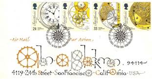
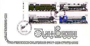
Remember too, that each stamp commemorates a person, event, or facet of popular culture. Studying his collection could keep one engaged for days. Take this next example, honoring English carpenter and clockmaker John Harrison. He not only built clocks in which all working parts were made of wood, he designed one of the first marine chronometers or “sea clock”, which kept accurate time despite the rolling, pitching and yawing of a ship buffeted by wind and waves. A book on Harrison’s work Longitude: The True Story of Lone Genius Who Solved the Greatest Scientific Problem of His Time, by Dava Sobel eventually led to a tv special produced by A&E, as well as a PBS NOVA episode titled Lost at Sea: The Search for Longitude. As for the history of the railroad, where to begin? It’s a story too extensive to even try and tackle here.
 |
 |
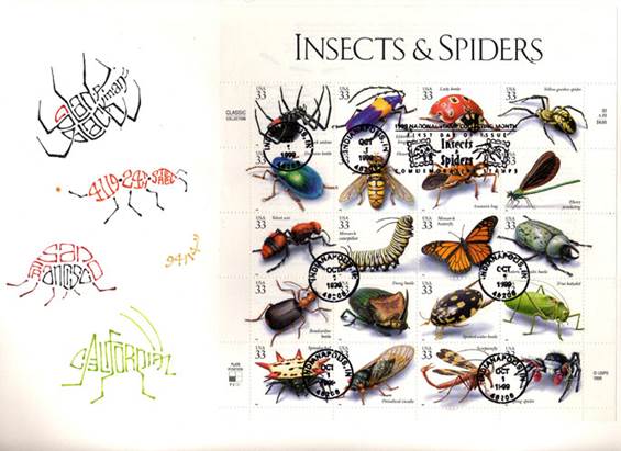
Blackman’s ingenuity crackles with every dip of the pen. Love this creepy, crawly entomological address.
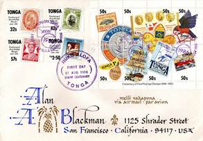
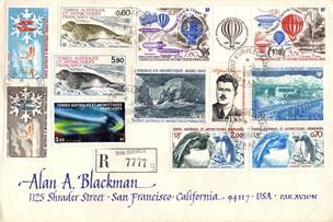
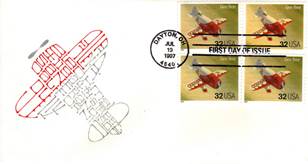
When the stamps were so numerous they commanded center stage, Blackman’s calligraphy quietly served as understudy in the wings, as it does here with stunning stamps from Tonga to Antarctica. What great joy his son must have experienced savoring these missives from around the globe.
 |
 |
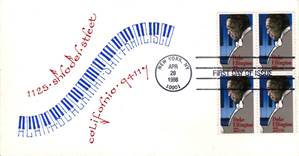
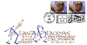
It’s interesting to witness interpretations on a single topic, matching the image to the soul of the artist –jazz can be smoky and wistful or jubilant and snazzy. From Ellington to Armstrong, the artist is spot on.
 |
 |
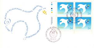
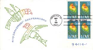
Taking Flight
From peacefully floating, to standing proud, to colorful couplings, to man taking flight, each image in this quartet expresses the freedom of soaring in its own unique way.
 |
 |
 |
 |
“Calligraphy is frozen poetry.”
Anon.
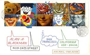
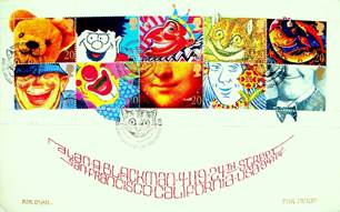
With clever humor and wry insight, his work always evokes a smile. Even Blackman had to give these grinning stamps a second chance to chuckle.
 |
 |
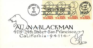
With understated elegance, Blackman captured the essence of beloved humorist James Thurber, eliciting gentle smiles from the viewer.
Once you experience the breadth of Blackman’s imagination, you’re not surprised to discover he designed the handsome typeface “Galahad”, or that he lent his magical touch to the happy typeface “Say Cheese” which makes maximum use of the ubiquitous happy face, while simultaneously personifying his own joyful spirit.

So creative, joyful and inspiring is his work, I consider it an honor to share it with you here. In Blackman’s own words “I believe that by the time I leave the planet, this collection will have become my most important work.” So much for accidental collections!
“Addison spoke in calligraphy while everyone else talked in scribbles.”
Shawn Martin, Shadowflesh
Just for Fun
This blog echoes adventures we explored in Writing most significantly, the importance stamps played in the romantic thriller “Charade” starring Audrey Hepburn and Cary Grant.
About Alan
Alan Blackman received a BA in Anthropology/Sociology from Queens College, NY, and B Litt in Social Anthropology from Oxford University, England. He was a museum artist at the Robert H. Lowie Museum of Anthropology at UC Berkeley.
He studied Lettering Arts Training at the California College of Arts & Crafts under Al Egbert, and his first formal calligraphy instructor was David Mekelburg. He counts as major influences Arthur Baker, Alfred Fairbanks and Hermann Zapf. Blackman has taught calligraphy classes nationwide since 1976 as well as in England, Germany and Japan. Subjects have included ‘Brush Script’, ‘The Italic Alphabet’, ’Roman Capitals Without Tears’, ‘Calligraphy & Color’, ‘Addressing Envelopes’, ‘The Search for New Forms’, ‘A Calligraphic Tapestry’, ‘How Far Is Far Out’ and others.
His work is included in the collections of the Victoria & Albert Museum in London, and the San Francisco Public Library. “Letters to Myself” from which these images were sourced, can be viewed in the Jewett Gallery from Jul 26 – October 11, 2015, presented by the Marjorie G. and Carl W. Stern Book Arts & Special Collections Center, funded by Friends of the San Francisco Public Library. (Yes, the purple hair is intentional and the sparkle in his eyes inextinguishable.)
Join the Conversation


![]()
![]()
![]()
![]()
![]()
![]()